Network Analysis and visualization appears to be an interesting tool to give the researcher the ability to see its data from a new angle. Because Gephi is an easy access and powerful network analysis tool, we propose a tutorial designed to allow everyone to make his first experiments on two complementary datasets.
After a short introduction about the basis of SNA and some examples which shows the potential of this tool and gives some inspiration, this tutorial is divided into 2 main “exercices”: a geographical network of 1000 individuals sending letters all over Europe and a 2-mode network of 100 members of 10 different institutions.
Note that Gephi has been updated since this tutorial. The updates have an impact on the performance but almost never on the interface, so this tutorial is still valid. A video version is often requested, so here is a new 2022 version:
If you want to cite this tutorial, please use the following citation:
Grandjean, Martin (2015). “GEPHI – Introduction to Network Analysis and Visualization”, https://www.martingrandjean.ch/gephi-introduction
1. INTRODUCTION
1.1 A short introduction to Social Network Analysis
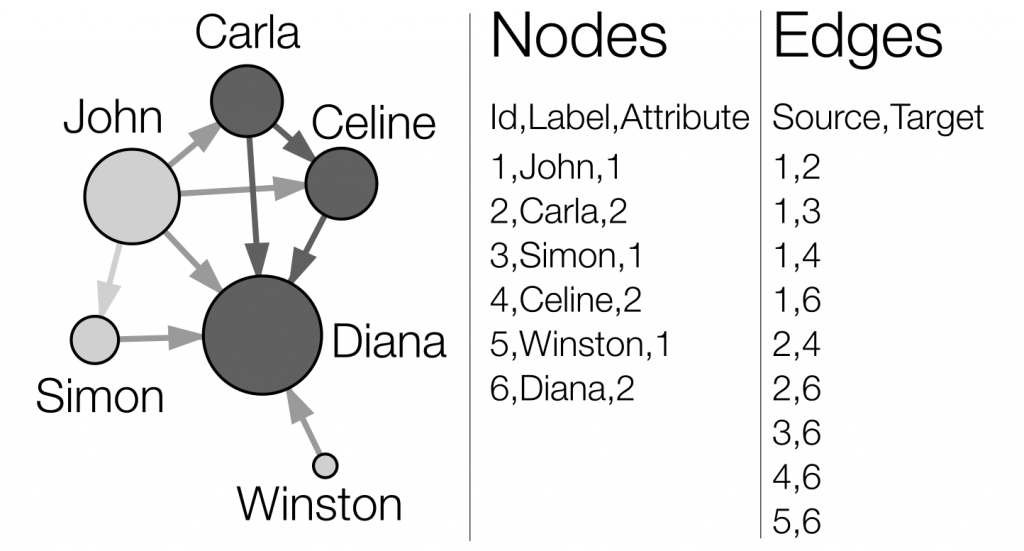 A network is made of two components : a list of the actors composing the network, and a list of the relations (the interactions between actors). As part of a mathematical object, actors will then be called vertices (nodes, in Gephi), and relations will be denoted as tiles (edges, in Gephi).
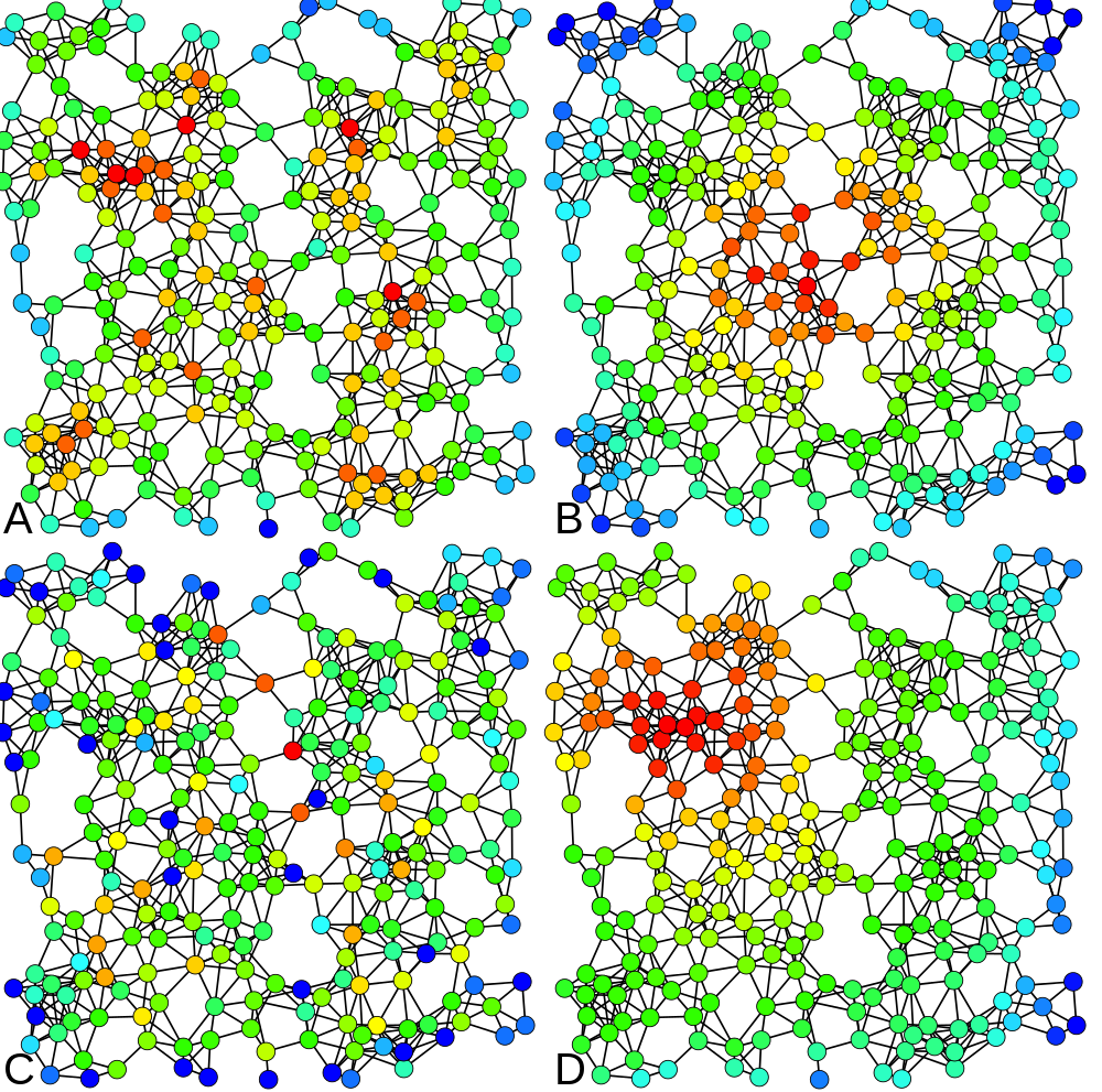
4 types of centrality measures (Claudio Rocchini, Wikimedia)
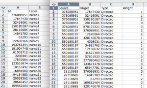
Here left, a very simple directed social graph, with both lists explicited. Two attributes are attached to the nodes : a label (his or her “name”) and a numeric attribute (here, a distinction between boys and girls). In the edge list, “Source” and “Target” entries refer to the nodes’ identifiers (Id).
In our example, the attribute determines the color of the nodes. The size of a node depends on the value of its “degree centrality” (its number of connexions). The centrality measures are essential metrics to analyze the position of an actor in a network. They come in many variations, as shown at right (A = Degree centrality, number of connexions ; B = Closeness centrality, closeness to the entire network ; C = Betweenness centrality, bridges nodes ; D = Eigenvector centrality, connexion to well-connected nodes).
1.2 GEPHI visualizations: some hand-made examples
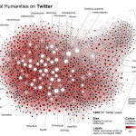
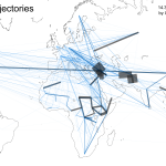
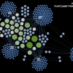
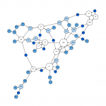
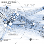
This is by testing that we learn. Examples of what is possible to do may help to conceptualize our own networks.
2. SET UP
2.1 Downloading and installing the software
 The software can be freely downloaded here:
▲ The new versions of Gephi (2022) are relatively compatible with common configurations. Some compatibility problems may occur. You’ll find more ressources about these issues on Gephi Facebook group / Gephi subreddit / etc. After a few attempts, do not hesitate to let a comment here!
2.2 A few plugins
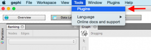
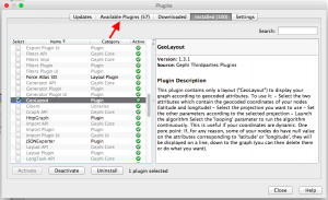
In order to go beyond the basic functionalities of the software, we will work with three additional plugins: GeoLayout, NoverlapLayout (now implemented in Gephi) and Multimode Networks Transformation. You’ll find the Plugins in the Tools menu. Refresh the list and select the requested plugins. You’ll have to restart Gephi shortly after the download (plugins appear only after a restart).
2.3 About the datasets
We will use two datasets (different data to explore different features) :
| Dataset 1
1.000 nodes / 14.116 edges (1-mode, directed) |
| Dataset 2
110 nodes / 142 edges (2-mode, undirected) |
Depending on your browser, you may have to “save as” the files on your desktop.
3. PART 1: MAPPING LETTERS OVER EUROPE
3.1 Importing the data into GEPHI
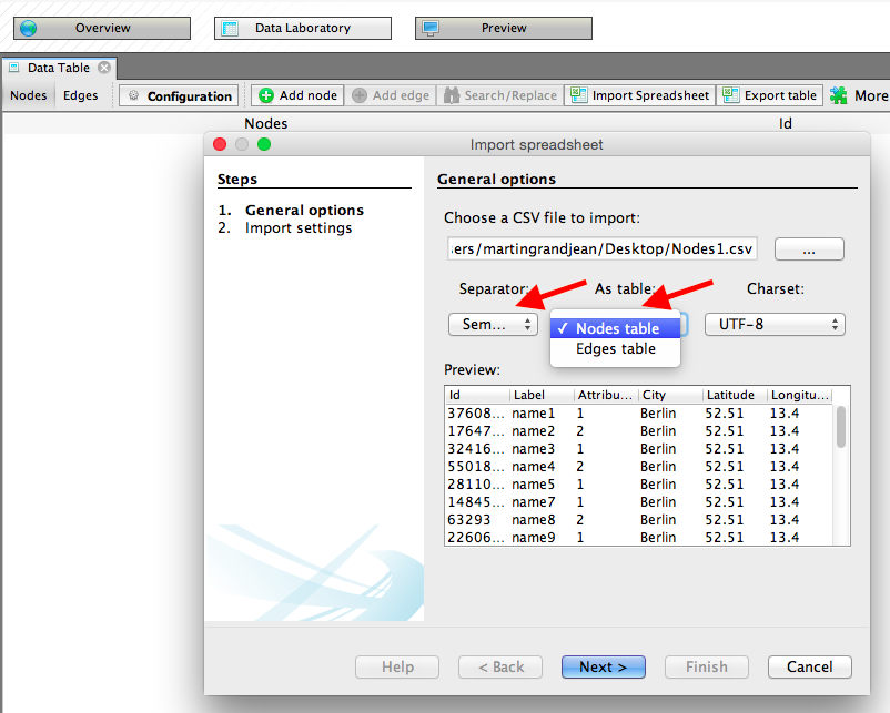
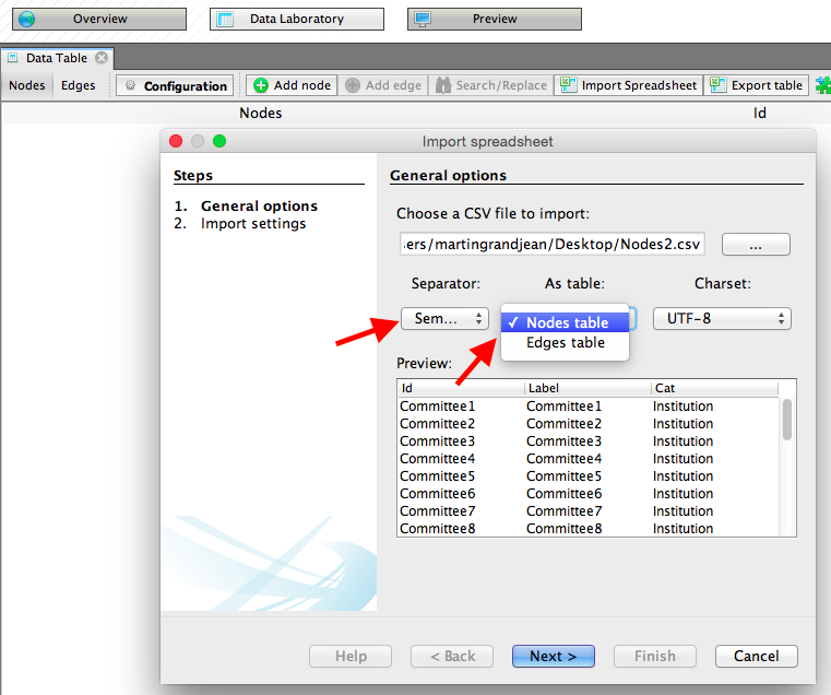
Run the software on your computer and create a “new project” in the start window. In the Data Laboratory, click on “Import Spreadsheet” to open the import window and import your first file.
Nodes 1
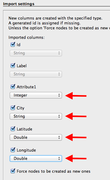
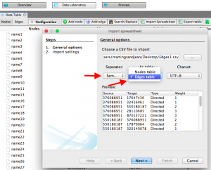
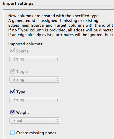
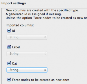
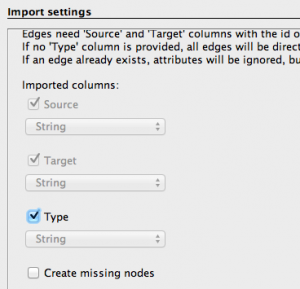
Specify that the separation between your columns is expressed by a semicolon and do not forget to inform Gephi that the file you import is containing nodes. Then press “next” and fill the import settings form as proposed. The “import settings” step is very important: Gephi will recognize some of the columns because of their header, but you’ll always have to check that the software will be able to understand the nature of your data. In our example, be sure to inform Gephi that our latitudes and longitudes are a “double” variable (not an “integer”).
Edges 1
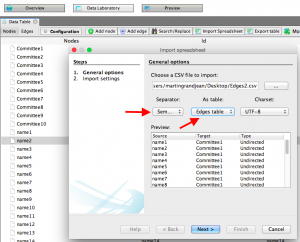
Follow the same procedure, but with the “edges” file downloaded before and fill the forms in the following manner: specify the semicolon and inform Gephi that you’re importing the edges. Fill in the last fields and uncheck “create missing nodes”, because you’ve already imported them.
3.2 One-mode graph visualization
The action now takes place on the Overview panel. The software produces an overview of the graph, spatialized randomly and completely unreadable.
Nodes’ size
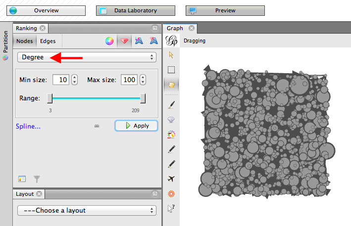
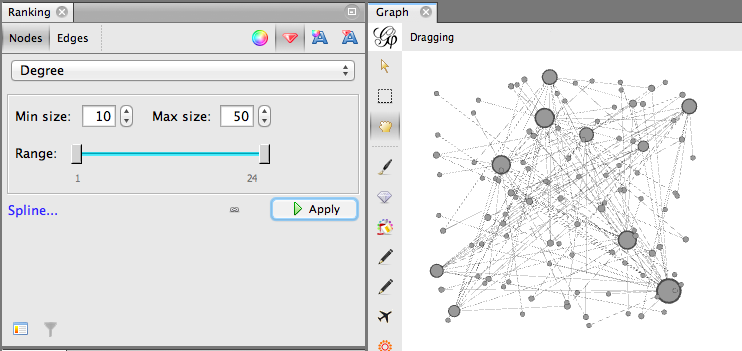
Let’s give nodes a size proportional to their degree (number of connexions). In the Ranking panel of the left column (top), select “Nodes” and the “red diamond“ (now a circle logo), then select “Degree” in the rolling menu and enter the minimal and maximal value (we propose 10-100). You’ll see that the distribution of degree within your corpus is between 3 and 209: at least one node is connected to more than 200 others (and the least connected node is connected to 3 of them). Be aware that if you want a visually correct result, you’ll have to use the “Spline” blue link to edit the shape of the spline: linearly double the radius of a node is more than double the area because of the power function.
Spatialization
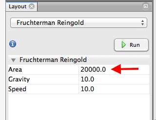
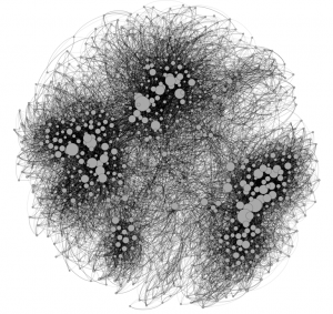
That’s the main part! Let’s begin with a spatialization that gives more space to the graph, but maintain it in a decided area: Fruchterman Reingold, with the same values as in this model (20.000 – 10 – 10). This visualization disposes nodes in a gravitational way (attraction-repulsion, in fact, as magnets). You’re already able to distinguish communities (more densely connected parts of the network). Let the function run until the graph is stabilized. Use the little blue magnifying glass (bottom left of the graph panel) to re-center the zoom.
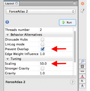
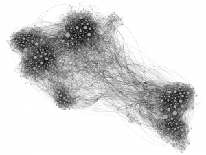
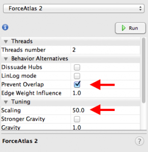
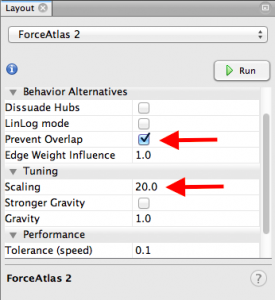
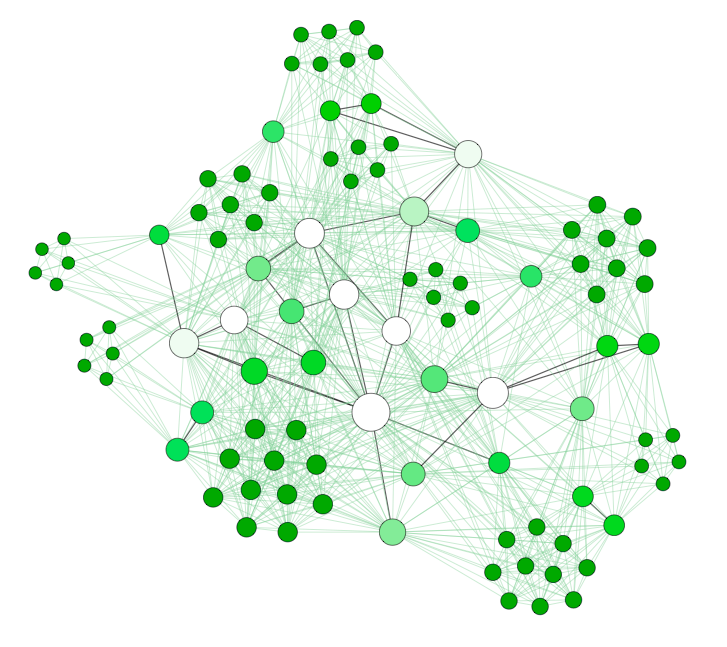
Then, we propose to use the Force Atlas 2 (another layout algorithm) to disperse groups and give space around larger nodes. Be careful, the parameters you enter significantly alter the final appearance (proposition: Check “prevent overlap” and change “Scaling” to 50). Let the function run until the graph is mostly stabilized. We can apply Force Atlas 2 directly without applying Fruchterman Reingold before, but as the “random layout” from the begining is a … random layout, it’s better to untangle the network before sumitting it to a strong force-algorithm.
3.3 Final rendering and centrality measures
Weighted Degree
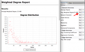
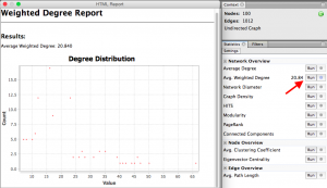
Let’s add some more information to our graph by giving the nodes new attributes, influencing their color. In the Data laboratory, select the Edges Table, and sort them according to their wheight. Some edges have a wheight of 3, some 2 and some 1. That means that we have to take these differences into account by calculating the weighted degree of the nodes. You also observe that this graph is directed: the edges have a source and a target, a direction shown by a little arrow on the Overview display. So, the degree we’ll have to calculate has to distinguish the in- and out- connexions. In the Statistics panel, click on “Average Weighted Degree” to calculate these values for every nodes. You get a report showing the distribution of theses measures.
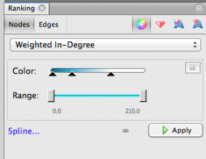
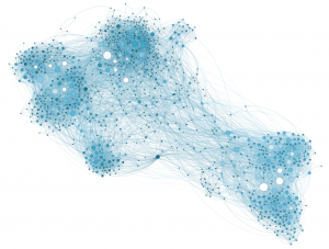
Now that theses values are calculated, new attributes are available in the ranking panel. Select the “color” icon, and chose “weighted in-degree” to color nodes according to the number of incoming edges. Little visual tip : use a dark color for small values and a light color for the highly connected nodes, in order to make the little nodes visible on the final graph (the well connected nodes are generally more visible).
Result: the biggest nodes (=with a high degree) are not always those with the biggest weighted in-degree : if we consider an edge like a letter written between 2 people, those who are writing a lot are not necessary those who are receiving a lot. It’s interesting to give different attributes to nodes size and color, to compare them. Of course, you can export this data to conduct a full statistical analysis, scatter plots, etc. (the measures you make are automatically added to your nodes table). Note that if you used the “spline” to adjust nodes’size before, this setting is still used by default here and should be modified (without interfering with you previous choice for the size).
Nodes’ label
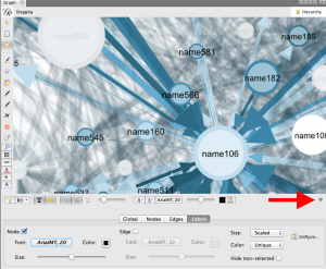
We will come back to these measures and extra features after, but let’s try to finalize our artwork for now by giving a label to the nodes. At the bottom right of the graph display, you’ll find a little sign which allows you to developp a new panel. In label, choose “nodes” to add their labels to your nodes and set their font, color and size. If needed, for example if your data don’t have any “Label” column, click on “configure” to set the column content you want to get displayed (the “ID” may be used as a label, i.e.).
Finalizing the graph
Go to “Preview” for trimming the final details. Unlike during previous stages, changing settings in this menu is reversible, and do not affect the structure of the graph.
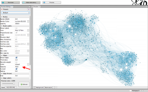
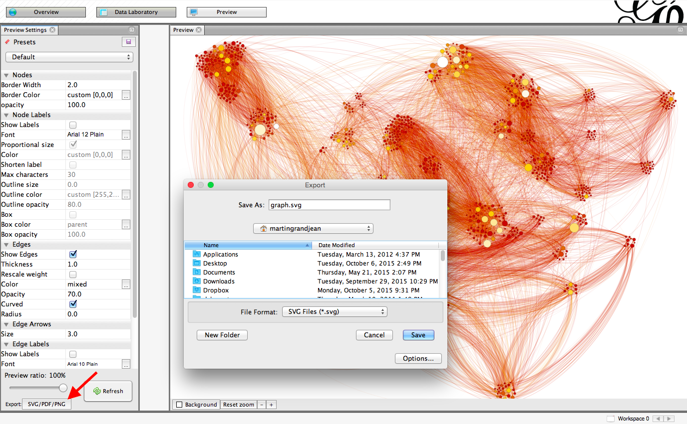
In the this screenshot, you will find a suggestion of settings for a good rendering (like setting the edges opacity to 70% for a better contrast with the nodes). Be aware that due to its large size, the graph may take a few seconds to update after each change (click on “refresh” to apply the changes). About curved edges : As a graphical convention, we use curved edges to show the direction of the edge, always turned clockwise. Non-curved edges are generally non-directed graphs.
At the bottom of this preview column, you find an export link. Note that exporting in .png produces figure with a poor resolution. You may want to opt for .svg or .pdf, which have the advantage of being modifiable by your own image/drawing software (I recommend the open source program inkscape for manipulating .svg files).
Modularity
The visualization is only one step, network analysis often needs other mathematical means to provide the researcher with a satisfactory result. Feel free to explore the “Statistics” menu, for example by playing with degree measures, density, path length, modularity.
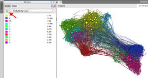
A network contains internal subdivisions called communities. There are methods that permit to highlight these communities, which depend on the comparison of the densities of edges within a group, and from the group towards the rest of the network (More here) In the right column of the “overview” page, click on Statistics/Modularity/Run to display the modularity window. Choose a resolution (between 0.1 and 2), click OK and close it.
The next step takes place in the Partition menu situated in the left column. Select “Nodes” and “Modularity Class” (rolling menu). You will be then able to modify the colors attributed to the detected communities by clicking on them. Do not hesitate to repeat this operation with many “Resolutions” ! If you decide to do so, you must deselect and reselect “Modularity Class” in the left column, and refresh color calculation.
Betweenness centrality
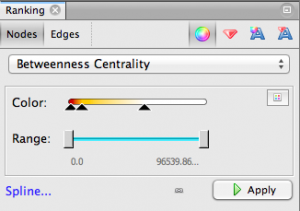
The betweenness centrality measures all the shortest paths between every pairs of nodes of the network and then count how many times a node is on a shortest path between two others. It’s a very interesting measure in the case of a network of letters sent and received as it allows the researcher to detect people that occupy an intermediate position between two other people or groups. In the statistics panel, click on “Network Diameter“.
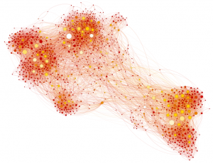
Like the Weighted In-Degree before, find a colorful way to highlight nodes that have a high Betweenness centrality. It quickly appear that nodes with a high degree/weighted degree does not always have a high betweenness.
3.4 Geographical layout
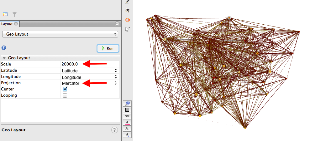
Geo Layout |
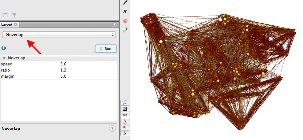
Noverlap |
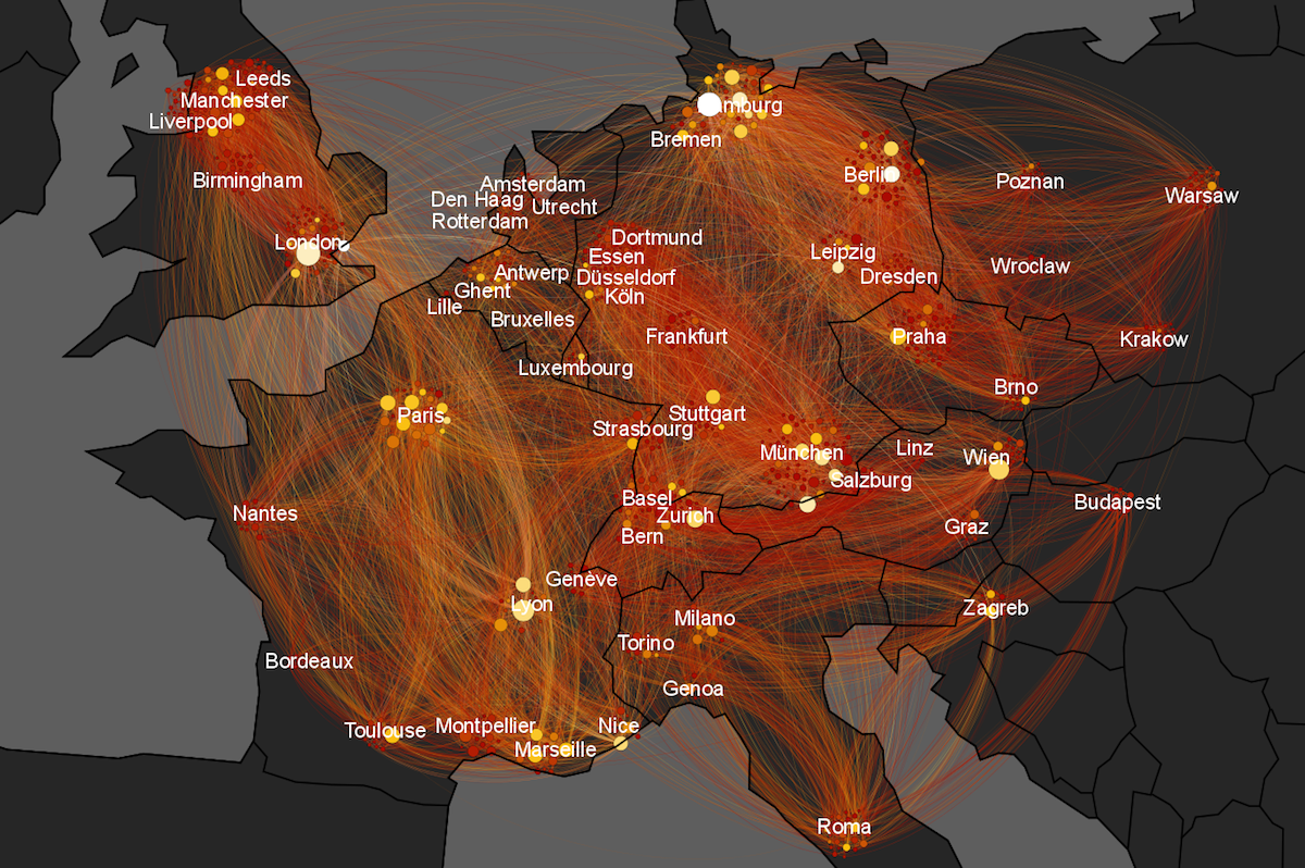
During the import, you’ve noticed that every node was given a Latitude and a Longitude. The Geo Layout plugin will help you display the nodes in a geographical way. In the Layout panel, select Geo Layout and give it a scale of 20.000. Be sure that the plugin understand correctly that “Latitude” as a “Latitude” and “Longitude” as a “Longitude” and set the projection to “Mercator” (this projection should be adapted to the map you’ll use after). As nodes are now grouped on a geographical coordinate, you’ll have to give them some space: use the Noverlap layout plugin to avoid them overlapping (a margin of 5.0 is enough with the chosen map scale).
In the Preview panel, check the final appearance of your artwork and export it in .svg. You’ll then be able to import it on a background map. If you’re familiar with Inkscape, download the map provided here (created to fit with the chosen scale and Mercator projection). Open it, and after having imported your network in it, select the city names layer and bring it to the front to make it readable.
Feel free to try the same map with modularity, the result shows that communities are strongly related to geographic particularities.
4. PART 2: COMMITTEES AND THEIR MEMBERS
4.1 Importing the data into GEPHI
Create a “new project” in the start window. We’ll work on a different type of dataset: a 2-mode network (2 types of nodes, committees and individuals). In the Data Laboratory, click on “Import Spreadsheet” to open the import window and import your first file.
Nodes 2
Specify that the separation between your columns is expressed by a semicolon and do not forget to inform Gephi that the file you import is containing nodes. Then press “next” and fill the import settings form as proposed. Inform Gephi that our “Cat” variable is a “String” (this variable will be useful to separate “members” and “committees” in a further step).
Edges 2
Follow the same procedure, but with the “edges” file downloaded before and fill the forms in the following manner: specify the semicolon and inform Gephi that you’re importing the edges. Fill in the last fields and uncheck “create missing nodes”, because you’ve already imported them.
4.2 Two-mode graph visualization
Nodes’ size
In the Ranking panel, give a size to your nodes (here, according to their degree between 10-50). In a 2-mode network, the degree centrality may not be a very interesting value, because of the structural bias brought by the two different categories of nodes: in our case, the “committees” will be naturally much more connected than the “members”. But in this first step, we’re just trying to visually distinguish the 2 categories.
Nodes’s color
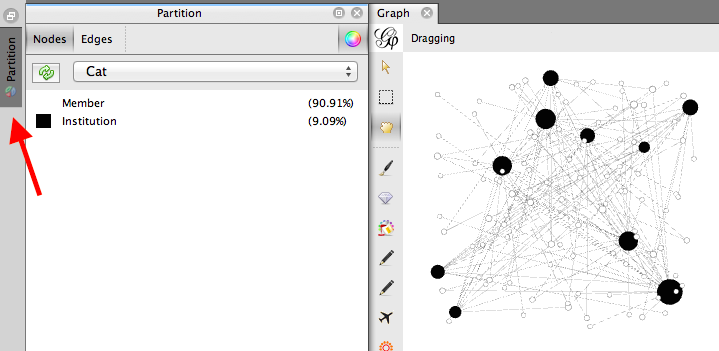
In the Partition panel, refresh the menu to make the nodes’ attributes appear (we uploaded only one attribute: “Cat”). Give a very different color to both categories and apply it on your network.
Set a layout
Deploy the network using the Force Atlas 2 algorithm (Prevent node overlapping and scale it to 50). Your graph is now visually readable and looks very similar to many organizations networks.
For many researchers, this visualization will be already enough to conduct their analysis. Don’t forget to display the nodes’ label if needed.
4.3 Projection to one-mode graph
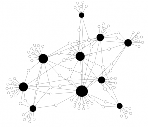
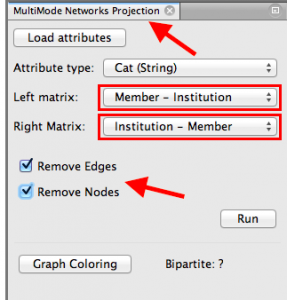
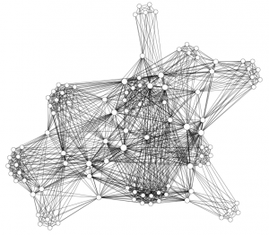
Use the MultiMode Networks Projection Panel (available through the plugin you dowloaded in step 2.2) and “load attributes”. You’ll now “project” the Institutions on the Members: if two members have an edge linking them with the same committee, they’ll now have a direct edge between them (and the committee will be evacuated).
Select the right attribute type (“Cat”), and set the matrix as proposed here (Member-Institution / Institution-Member): They must be symmetric with the type of node you want to keep at the beginning and the end.
Check the “Remove Edges” and “Remove Nodes” buttons, in order to clean the graph from the old “Committees” nodes and edges. And finally click on “Run”.
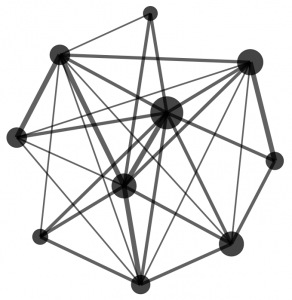
Note that you can also project the Members on the Institutions, with the result presented here on the right (edges are getting larger if many members were connected in the same committees).
4.4 Centrality measures and layout
Nodes’ size
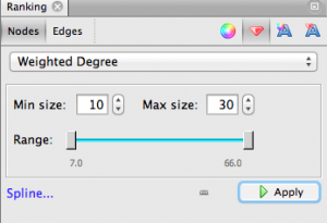
Calculate the new Degree centrality of the nodes by clicking on “Avg. Weighted Degree” (Statistics panel). In the Ranking Panel, apply this new measure to the nodes, as proposed here. The new degree may be very different from the degree in the 2-mode original network: a projection add lots of edges (in particular when lots of nodes where connected to a few very central nodes from the other type).
Nodes’ color
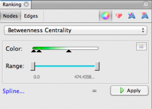
In the statistics panel, click on “Network Diameter” to calculate the Betweenness centrality of your nodes. Then use this measure to color the nodes. In such a network of people working in different committees/institutions/companies, knowing who’s at the intersection of two groups may be very important for HR officers, i.e..
Edges’ color
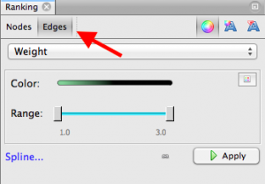
In order to highlight weighted edges, give them a color that will make the stronger edges more visible in your final display (Suggested here: black for all the edges bigger than 1).
Layout
Spatialize the graph once again (it kept the positions of the nodes before the projection from 2-mode to 1-mode), with Force Atlas 2.
4.5 Neighbors highlighting
This type of network is well suited to a “Linkedin” of analysis: Who’s in my network? Who are the people that I will be able to reach through them (what are their own connections)?
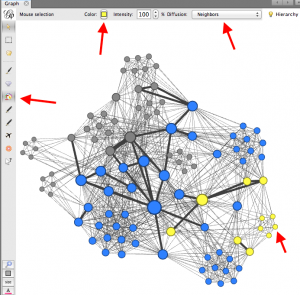
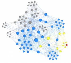
Click on the little paint bucket, on the left of the Graph area, and play with the tools on the top of this menu. First paint the “Neighbors of neighbors” (after having given a neutral color to all the nodes), and then the “Neighbors” of a selected node. In our example, the red node, member of only one committee, is directly connected to 10 colleagues, which are themselves connected to 49 other individuals.
5. CONCLUSION
Data visualization is a game, let’s play! Please help me to improve this tutorial by dropping a comment below with remarks, suggestions, links to your own results, etc.!






Excellent resource! I’ve just started to study how to use Gephi and this is just what I needed. Thanks!
All the better if my work can be useful. 😉
hi Martin
do you have similar document that describes how to use Gephi toolkit/API ?
regards
sayi
Hello, unfortunately, I didn’t produced this kind of document… :/
Nice . Do you have any use cases for plotting & analyzing flight routes that keep changing each day. Flights also have a vertical spatial dimension – the 4th being the speed. Data is available in coordinates of lat/longs and geojson polygons for spatial boundaries. Appreciate yr thoughts. Thx
Hi, thank you for your comment. Creating the network map with Gephi is easy (with the GeoLayout plugin, see this example: https://www.martingrandjean.ch/connected-world-air-traffic-network/), and then if you have temporal data, or at least a date for each edge, you’ll be able to make several versions of the same graph with different relations (or use Gephi timestamps). And then for the speed, you can add an attribute to the edges to show them with different colors or with a label, but you won’t be able to have a color that evolves during a flight, like on flightradar, because the edge is just 1 element, not hundreds of little segments.
Thank you for this excellent introduction. I want to apply GEPHI to art historical data: repetitions of masterworks or who duplicated whom? Anybody interested?
Very useful information for beginners! Thank you Martin.
Hi Martin,
Do you know if is possible change the node shapes and use different shapes for different categories/classes of nodes? I am interested in displaying nodes in the same graph with different shapes.
Thank you.
Thank you for this presentation! It is very helpful!
Bonjour Martin,
Super boulot. C’est en CC BY, est ce que ça veut dire que je peux aspirer et le proposer sur la page de mon cours pour mes étudiants ? (en citant bien sûr). Si oui, y aurait il une version “html à embedder” prête à l’emploi?
Bonjour, oui la licence CC BY s’applique sur ce tutoriel. Par contre, la structure du billet, avec ses nombreuses images, va rendre assez chaotique la reprise sur un autre support, à mon avis. L’embed serait une meilleure solution, mais il faut le bricoler soi-même, avec le même souci que pour la republication que si l’embed est moins large que mon billet, ça va faire sauter la mise en page. Sinon, on peut aussi imaginer insérer un lecteur de PDF dans une page, puisque ce tutoriel est aussi disponible sous cette forme (voir bouton sous la vidéo en haut du billet).
Merci !
Great stuff! Here’s a question though thta I don’t often see addressed in Gephi tutorials: How is the dataset created or acquired in the first place? I would assume also that the way the dataset is created determines how the visualization will work.
You’re right, the creation of the dataset is a “modelization”: there’s a choice behind, determining the visualization. But your question is too general to make an answer possible: dataset types are so many! When analyzing a network of letters/documents, your dataset is the result of 2 years of indexing! When analyzing a network of tweets, you take 1 hour to download tweets with the API. When analyzing a network of institutions, you’ll simply create an Excel spreadsheet and complete line after line the relations between the institutions…
Hi Martin,
I am interested to see if it is possible to use email traffic, for example, between members of an organisation of about 150 people and then look at the resulting visualisation to see whether there are any insights to be gleaned for organisational reform. How would you collect the data for such a project?
Of course, email traffic can be analyzed as a network. But, even if I may help you conceptualize how to code the email metadata or visualize it as a network, I can’t help you in the data retrieval. If you’re not working on an intranet corpus, or an internal (or public) mailing list, you’ll have to ask your 150 people their email archives, I fear.
Great post. I’m wondering if there is any layout plugin such as the geo layout that allows us to group nodes in the graph by a node attribute rather than by network structures. I’m trying to produce a graph that displays the network grouping the actors from national, state and municipality level, but I would like to do it from an attribute of the nodes.
Thank you for any insight.
Thank you for your message! There’s a home-made trick to achieve this goal: making a new column in the nodes’ file, with an attribute, and translating this column into two others : latitude and longitude, on the basis of a geographical sketch of the display you want to obtain (no need of being a “real” geography, give 1/1 to category 1, 1/2 to cat.2, 2/1 to cat.3 and 2/2 to cat.4, i.e.). Then use the Geo Layout plugin to group the nodes, and use the Nodes Overlap plugin to give them space. I’m using this trick when giving to my network an “institutional layout” : see illustration #8 of this post.
Hi Martin, thank you so much for your help! And congrats for your nice work on sharing knowledge. Tks
Really great post Martin, I learned a lot! Thank you! 🙂
while trying to install Multimode Networks Transformation. It says org.gephi.data.attributes.api needs to be installed. How do i install that ?
Hi! I never had this kind of message. Are you working on Gephi 0.8.2 or 0.9 (if you’re working with the brand new version, the plugin will probably need to be updated by its creator)? As we are in a transition period, if your problem occurred when downloading the plugin, it’s also possible that the Gephi website was under maintenance.
that might be the the problem. will try 0.8.2. thanks.
Hello, I’m building a network similar to your committees and members (events and attendees) and this tutorial in invaluable for me as a complete beginner. I would like to see in my network only those attendees who have attended more than three events. How do I do that? Thank you!
Thanks for your interest! In your case, you’ll be able to filter them after the 1st step of your visualization: when you’re still in the 2-mode network (a network of attendees and events), the (unweighted) “degree” of your attendees will simply be the number of event they where linked with! (Filter them in the “data laboratory” and delete all the attendees with a degree smaller than 3) Then, do the 2nd step with the projection to a 1-mode network.
Hey Martin,
I started to explore Gephi very recently because I am going to conduct research on Social Network Analysis. But there are a lot of things I don’t understand yet, because I have never worked with such software and it’s all new to me. (And okay, I admit, sometimes I start panicing which is never a good idea).
I have a few questions that I would like to ask you:
1) When I import a spreadsheet for the edge list – which contains a column with ‘weight’ – Gephi refuses to import the numbers I’ve put in that column. So, in Excel I filled the column with values like 8, 12, 16 etc. but when I import that spreadsheet as an edge list, Gephi does recognize the column but doesn’t recognize the values that are in it. When I go do the data laboratory, I notice that the whole column there (= the weight column) is filled with “1.0”. What could be the problem?
2) When I make a graph and when I am pleased with the way it looks (after some colouring of course etc.), I go to “preview” and I click on ‘refresh’ but nothing happens. Why is that? The preview function never works, whether I’m making a 1-mode network or a 2-mode network.
3) What is the actual difference between directed and undirected networks? I know that direct networks are something like people sending each other letters, while undirected networks are more like people who attend events (= the people are connected to each other by means of the event they’re attending, right?). But could you please give me some more examples?
4) If I want to import a spreadsheet as an edge list and I have put about 60 ‘source-target’ undirected relations in the Excel file, then why does Gephi refuses to import all of the 60 entries? When I go to data laboratory, I only get a relatively short list of about 10 or 15 relations.
5) If I want to analyze the network of students and universities, is it correct if I make a 2-mode network with 2 node lists and 2 edge lists?
-> node list n°1: in the ‘id’ column: numbers (1 to 12) + in the ‘label’ column (names of students e.g. Rozelinde)
-> node list n°2: in the ‘id’ column: numbers (13 to 15) + in the ‘label’ column (names of universities e.g. KU Leuven)
-> edge list n°1: in the ‘source’ and ‘target’ columns: the relations between the students (based on their IDs of the node list) + ‘type’ (undirected) + ‘weight’ (5 or 10, depending on the kind of relation)
-> edge list n°2: in the ‘source’ and ‘target’ columns: the relations between the students and the universities (based on their IDs of both node lists) + ‘type’ (undirected) + ‘weight’ (8,12 or 16)
Sorry for my very long message… I hope you don’t mind. I think you could really enlighten me with your knowledge on SNA and Gephi, because the above article is great. It’s of a very high quality. And you have something which I still don’t have: expierence with this kind of software.
Thanks in advance
Kind regards,
Rozelinde
Dear Rozelinde,
Thank you so much for your extensive comment (is that a comment? it’s a blog post! ;-)). Before answering step by step, it is still unclear for me if you were able to get through this tutorial or not, with or without the problems you’re mentioning (the answer to this question will be important to understand if you have a problem of data coding, simple misunderstanding or software version/compatibility). Preamble: this tutorial has been made for Gephi 0.8.2, and as the new 0.9 version is not completely stable yet, I recommend to use this old version until new developments. The problems you’re sharing are very likely to be caused by this new version.
1/ When you import an Edges file with a “Weight” column, Gephi recognize this column as containing “Float” values. How is it in your case?
2/ It’s a bit trivial: the graph is displayed only after clicking “refresh”. If it don’t work, is it a problem of zoom (if you’re in 1% or 1000%, you may not see your graph)? Did you tried to change some values in the “Preview settings” (and then hit “refresh”)?
3/ It changes the mathematical properties of the graph. A directed graph is generally the expression of a non reciprocal network, like people following others on Twitter (without necessarily following back), or letters sent, tweets, people buying goods to others, information circulating, etc. Undirected graphs are likely to be organizational charts, people member of the same institutions, etc.
4/ Unknown problem. Is there some special characters, punctuation or tabs, in your spreadsheets that may makes the software read your CSV in a wrong way?
5/ You’re not building a 2-mode network, in the example you shared. In a 2-mode network, the edges are only possible between nodes of a different type. That means that you’ll have edges between students and universities, but not between students and students, or universities and universities. You’re supposed to have only 1 edges file. You may have 2 or more nodes files, but these files are easy to copy-paste to one single file, with ID, Label… and a value that will show the software what’s the difference between the 2 types of nodes (a column where you specify “student” or “university”).
Hey Martin,
Thank you so much for your quick reply! Haha you’re right, my post is more like a novel. Maybe it has to do with the fact that I have a master’s degree in translation: I love reading and writing long texts 🙂
Well, the problems I faced are based on the fact that I use version 0.9 of Gephi. I think that you have a better version, although it is an older version of the software, but still, the 0.9 version seems to contain some bugs (so I’ve heard and so I’ve noticed). So the fact that I am asked you so many questions has nothing to do with your tutorial (which is wonderful and very clear!). Do you recommend to delete version 0.9 and install version 0.8.2 instead?
1) Well, the word ‘float’ is nowhere to be found when I import my edge list. Gephi recognizes the values of the weight column as ‘double’ (in the ‘import settings’ box). But ‘double’ is greyed out so I cannot change it.
2) Yes, I know that I have to click on refresh, but nothing happens, even when I click on it a thousand times. What do you mean with ‘zoom’? Do you mean the ‘preview ratio’? It put it on 100 % but nothing happens. And I have tried many times to change some values in the preview settings to get a preview (after clicking on refresh), but I am still looking at a grey area with no visualisation at all.
3) Thank you so much for explaining the difference between directed and undirected!
4) No, I don’t think that Gephi reads my CSV fiiles in a wrong way.
5) For the node list: when I want to add that extra column to make the difference clear between the ‘student’ nodes and the ‘universities’ nodes, what’s the heading I need for that column? Or it doesn’t matter which heading I use? And is it better to have attributes based on numbers (for example: the whole column is filled with 1 or 2; 1 refers to students and 2 refers to universities) or on words (for example: the whole column is filled with the word ‘student’ or ‘university’).
Thank you so much for everything !!
Hi Martin, I have a graph with some 50,000 nodes. Which layout do you think will be best for the visualization.
Hello. Well, it does not really depends on the number of nodes, but probably more on the density of the network. My advice would be to begin with a “soft” spatialization algorithm (like Fruchterman Reinhold) before trying a more “radical” one (force-directed).
Hi Martin,
I have some problems with the weights. I have build a csv file similar to your Edge1, (I start with some Twitter interaction downloaded from Socioviz) but I don’t understand how I have to attribute weights to every row. How did you calculate yours?
A second question: is useful put weights also in the Nodes table?
Thank you!!
Elena
Hi! In the case of a Twitter analysis (if you’re analyzing tweets and not followings/followers graphs, where the edges are not weighted because you’re only following an user once), you won’t “calculate” the weight of your edges, Gephi will do it. If you’ve 3x a tweet from @user1 to @user2, then Gephi will create a single edge with a weight of 3.
No reason to put a “weight” column in the nodes table, there’s no “weight” attribute for nodes.
Thank you Martin!!
Hi Martin, I’m just starting to understand Gephi and your “Gephi Introduction to Network Analysis and Visualization” with the clear examples you gave was the best material I’ve found to start with in this stage. For a first lesson it was VERY helpful. Of course I still have doubts about the preparation of my database to be imported by Gephi, but I´m much closer to understanding the functionalities of the programme. Thanks
Thank you for your kind feedback! Don’t forget to ping me on Twitter when you get your first graphs! 😉
Dear Martin,
I cann’t find the Ranking panel on Gephi. I thought something was wrong with the version I had, then installed Gephi on a second computer and the problem remains: cann’t acceess the Ranking panel. Have you any idea of what could be wrong?
thanks for helping.
The tutorial uses Gephi 0.8.2. In the new 0.9.1 version, the “ranking” and “partition” panels are merged under the new “appearance” panel.
Hi! Thanks for this amazing tutorial, but I’d like to ask you where to find the plugin needed if not appearing under the “tools>plugin>available plugins” menu. I got version 0.9.1. Thank you in advance!
You may need to refresh the plugin list. And it’s clear that all the plugins of the 0.8.2 version are not (yet) available on the 0.9.1.
Dear Martin,
your tutorial is simply perfect and I wish to say thank you very much for having created this. Its perfect for getting into Gephi and using it. I have been looking for exactly this and no other resource on the web is as well made and applicable as yours!
Two things I am struggling with for a while now (I am writing a Masterthesis about SNA about the Network evolution of an ticketing and event platform). Therefore I would like to make use of the timeline feature and the geofeature as well. So first I would like to create a movie with the network evolution over time and location.
What I am desperately looking for is a list explaining what format to use for what type of import data. I am talking about the dropdown when you import a spreadsheet (Double, Integer, Float,..). Are you aware of such a list?
And most importantly: Have you created such a comprehensive tutorial also for the creation of an dynamic graph? I’ve been looking for it a long time but was not lucky yet wich is why I am reaching out to you.
Thank you very much for your help! It is much appreciated!
Best,
Alex
Did my last comment not go through?
Dear Martin,
also from my side thank you very much for this high quality and very comprehensive tutorial! Like many others I have been looking for exactly this and it helped me a lot already!
I am writing a Masterthesis within the field of SNA and try to show the network evolution of an ticketing/event company over time and location. Therefore your explanation of the geolocation part was very helpful!
Currently I am struggling with two things:
Are you aware of a list that explains which format to use for the import data. I mean when you import a spreadsheet you can set each cell to String, Float,… but I just know some of them and was not successful with trial and error so far..
But the most important is: Do you know of any source that gives an comprehensive introduction or tutorial (like yours) that explains dynamic graphs, the import and data preparation of dynamic data and alike?
Thank you again very much this is highly appreciated!
Best,
Alex
Hi Martin,
thank you for these useful and accessible posts, very helpful to guide one’s first step in the world of SNA!
I have a very (basic?) question: are edge weights in Gephi interpreted as costs or strengths?
Depending on the software used, it’s one or the other (eg, in the R package tnet weights are strengths, but in the igraph package they are interpreted as costs/distances). In Gephi I am not sure, although I have a feeling they are interpreted as strengths (ties with higher weight represent stronger connections between nodes).
I’m working with a network representing genetic relationships between individuals. I have two individuals that are strongly connected to each other (let’s say they are genetically strongly related); should I make the tie between them represents that strong genetic connection (and express it as a measure of genetic relatedness, so the inverse of genetic distance?), or should I use instead genetic distance, so that the tie represents the shortest path (shortest genetic distance), so consider that edge weights represent “costs”? I want to find communities of individuals based on their genetic links, so based on their genetic relatedness…
Hi Marc, thank you for your comment! Your feeling is right, in Gephi edge weights are strengths. In your case, you’ll probably (I’m not into genetics) use the relatedness of 2 individuals: a stronger edge between those who share a large part of their DNA and a thiner edge between those who share a smaller part.
Thanks Martin,
indeed I confirmed that feeling by playing with a mock network with four nodes and geographical distances as edge weights. I don’t think it is said clearly enough in Gephi, and that information is critical I think, to ensure that people properly analyse and interpret their results in the case of weighted networks.
And yes, I’ve used the inverse of genetic distance (which gives genetic relatedness) as weight for my edges, so that closely related nodes share stronger ties.
Thanks again for your quick answer, and for maintaining this very interesting and useful blog!
Hi Martin,
First, great blog, it has been really helpful as work with Gephi. I have been noticing that it takes a LONG time (>15 minutes) after I run a statistical method (like betweenness centrality) before I can see this attribute listed in the “appearance” window for choice in how I graph the nodes or edges (note I do not have the “ranking” window you allude to, not sure as I am using version 0.9.1 but I am guessing the window names were just changed). Note that the results of the analysis appears immediately on the data table but the attribute is long delayed in appearing in the appearance window. In fact, sometimes after an analysis I have no options for attributes under the node/edge appearance. Is there a way to make the “appearance” window refresh more quickly?
Thanks,
Josh
Hi Josh, thank you for your comment! I sometimes have the same issue, but solving it never took me more than 3sec.: I select the drop-down menu and move it to the “neutral” position (“—Chose a rank parameter”), and then the menu refresh the available parameters. Or I change the window from Nodes to Edges and Edges to Nodes to make it refresh. Does it work for you?
I will try. It may have to do with the size of my data set which contains about 7000 nodes which have 1-20 edges each. Which version are you using that it states “—-Chose a rank parameter” as mine is consistently calling that window “appearance” instead of “ranking” and the neutral state there is “—-Chose an attribute.”
By the way, do you have any experience with exporting the results of network analysis in Gephi into R or another statistical program in order to determine the relationships between the attributes on nodes (in my case, sales for that customer) and created variables based on the network like betweenness centrality meausure?
Hi, Excellent resource and a great introduction to the use of Gephi.
Will using RDFs as my dataset provide same functionality as other conventional datasets. Would really like to know this.
Hi Martin, a very wonderful post. I am new to Gephi and I am creating a social network visualisation. Is there any way in gephi 9 through which I can add images to nodes – eg. images of individuals. Thanks.
Hrishiraj.
Hello, and thank you for your comment! There’s the Image Preview plugin, but I never tried it and don’t know if it will be compatible with 0.9.1 (if not, get back to 0.8.2).
Hi Martin, excellent post, it was really helpful in building social networks of microbial communities!! But I don’t understand well the meaning of the ‘Preview ratio’ slider in the Preview page, what’s its function?
I use Gephi on Ubuntu 14.01
Thanks for your help,
Valerio
Oh, sorry, I forgot to answer! The preview ratio slider is a way to sample the data you want to get visualised in the preview, as the preview mode is generally the interface used for the last graphical settings before export (and if your dataset is very complex and heavy, playing with these parameters on a portion of the graph will be quicker).
Thank you Martin for your answer, it was helpful!!
Thanks for your guide,
Valerio
Hi Martin, Thanks for the helpful post. I can’t locate the noverlap plugin. Any thoughts?
Hi, in the last update, it seems that the Noverlap layout plugin is already included in the “basics”. So you’re supposed to find it in the “layout” panel (in the list where you find the other algorithms, like Force Atlas 2, etc.).
hI martin, thank you for the wonderful post. I am a student and it is helping me a lot. However I a bit stuck. I got a huge dataset for my research and I categorised the nodes and uploads the dataset in gephi. However for edges, I don’t know how to make a list, because all the nodes are related to each other, so I cannot define source and target. Is there anyway i can upload the dataset in gephi for edges ?
Hi, I don’t know what your dataset is about, but generally you’ve better to take care of the edges before the nodes (as Gephi will automatically create a nodes’ file from the nodes present in your edges’ file).
If you want to create a file where all the nodes are connected to each others, here’s a little trick: take the ID column of your nodes’ file, name this column “Source”, create a second column (called “Target”) called filled with the same value, like “test”, and then import it in Gephi like an edges’ file. That will create a 2-mode network that will look like a star, all your nodes will be connected to the “test” node. Then, you’ll use the Multimode Projection plugin to make a projection of your 2-mode graph to a 1-mode graph, and then, all of your nodes will be connected together, as they were all connected to “test”. Is it understandable?
By the way, if you’re really sure that it is normal that “all the nodes are related to each other”, then I don’t see the interest of doing a network analysis of it… Or maybe I don’t understand your problem.
How do you make Gephi (0.9.1 in Windows) make curved edges in the network graphs?
All I ever get is straight edges.
Also, how can one adjust the size of the arrows?
Is there a spline or other adjustment for that?
Hi, these details can be edited in the “preview” mode, don’t you see them?
Hello Martin,
you seem to be very familiar with gephi so I hope you can help me with my question.
is it possible to apply a layout (like the Fruchterman Reingold) and dictate the distance of any node to the center?
I have 25 different nodes, each of them has a value between 2 000 and 10 000 (of course these values can be adjusted/inverted etc.) and I want the nodes with the higher values to be positioned closer to the center. (Theoretically they are all linked to the center (node), but I don’t want these links to be shown)
So the forced layout should be applied to position the nodes evenly in a layout with the according distance to the center.
Additionally, all the 25 nodes are linked with different strenghts/weights (between 0 and 1) to each other.
Here higher edge values should lead to thicker edges between the nodes, the distance in terms of length of an edge between two nodes doesn’t matter (position of nodes dictated in the first step should be kept!)
And is it then possible to set a cutoff value (weight>x) to only show edges with edge weights above the cutoff value?
Thanks in advance!
Peter
PS: How long would it take you as an expert to create such a graph? I have to do it pretty urgently and when you say it’s not even easy for you I can forget to think about it.
This is an excellent introduction to Gephi. Thank you.
Bonjour Martin,
Merci beaucoup pour cette belle introduction : pour les débutants comme moi, spécialisé en Humanités, elle est fort utile!
J’ai une question sans doute un peu vaine (je ne suis pas du tout fort en informatique…) : peut-on créer un graphe avec des noeuds intermédiaires?
Je m’explique : supposons que je veuille visualiser le trajet parcouru par des automobilistes passant par Montréal. Certains viendront de Québec pour aller à Saint-Jean-sur-Richelieu, d’autres viendront d’Ottawa pour aller à Trois-Rivières. Ce que je cherche à faire, c’est de visualiser à partir d’un départ donné, les chemins parcourus et les étapes empruntées, sachant que plusieurs chemins peuvent passer par les mêmes étapes sans forcément aller aux mêmes arrivées.
Je me demandais donc s’il était possible de créer un réseau dirigé (par exemple : Québec/Saint-Jean ou Ottawa/Trois-Rivières) qui comprenne des noeuds intermédiaires (par exemple : Montréal).
Navré si ma requête n’est pas claire… N’hésitez pas à me contacter si vous avec des questions!
Cordialement,
Sylvain
Bonjour Sylvain.
Bien sûr, c’est tout à fait possible. Il y a deux moyens de le faire : soit en utilisant les outils de dessin de Gephi directement, si les trajets sont assez simples (à gauche du rectangle central qui affiche le graphe, il y a deux “crayons” pour ajouter des noeuds et des arêtes), soit en créant un fichier avec les étapes, comme : Québec,Montréal / Montréal,Saint-Jean / etc.
Je m’étais amusé à faire de tels réseaux de “trajets” avec les métros de certaines villes : http://www.martingrandjean.ch/metro-quiz-15-subway-networks/ (ce n’est pas la même démarche mais cela revient au même, un réseau n’est pas forcément “social”)
Merci Martin pour votre réponse rapide!
Une dernière question : est-il possible dans ce cas de figure de lier en quelque sorte l’origine et la destination ensemble?
Je demande cela pour un cas de figure du type : 90% des automobilistes venant d’Ottawa et passant à Montréal vont à Trois-Rivières (les 10% restant vont à Sherbrooke), tandis que 60% des automobilistes venant de Québec et passant par Montréal vont à Saint-Jean (les 40% restant vont à Sherbrooke).
Cela permettrait statistiquement parlant de prendre en compte le fait qu’un automobiliste venant d’Ottawa n’ira jamais à Saint-Jean, et qu’un automobiliste venant de Québec n’ira jamais à Trois-Rivières, même s’ils transitent tous les deux par Montréal (d’où l’intérêt d’avoir Montréal comme noeud intermédiaire commun dans les trajets Ottawa/Trois-Rivières et Québec/Saint-Jean).
Merci encore beaucoup pour votre aide!
Sylvain
Est-ce que vous ne penseriez pas à un alluvial diagram? Ca semblerait plus proche de ce que vous souhaitez, non ?
Je n’y avais pas pensé, mais après regardé ce que c’était, ça me semble être tout à fait ce dont j’ai besoin! Merci pour la suggestion!
Hi Martin,
I just downloaded the gephi program and I am pretty much overwhelmed by its functions and possibilities but also by its complexity as I am not very much into data science before. But nevertheless I was looking for a tool to visualize my business network and to get more proper overview of where know the people from and if they might no each other as well and so. But I still dont have any idea how to collect the data in excel and to important it into gephi to get a nice visualization.
I hope you can help me out on that and congrats again for such a nice tool.
Best regards,
Thorbu
Dear Martin,
Thank you for your great tutorial.
I am using geolayout to map my institution’s collaborations. However, I am struggling to scale a map to the geolayout svg output. Could you explain how you scaled your map to match to your SVG? Do you make use of a specific tools to create your map?
Thank you in advance!
Hello. Well, it’s really just about drawing it manually in Inkscape (or Illustrator, Indesign, etc.). The only requirement is to chose a map that is projected with the same projection Gephi uses (like Mercator). You’ll find many free maps on Wikimedia Commons, even already in SVG. And then, you’ve to choose 2 very recognisable dots of your network, in 2 very recognisable cities, and adjust the whole graph with these 2 points.
Hello Martin, thank you for the wonderful introduction to Gephi. Its a great tutorial for beginners like me. Do you have any tutorial on how to use Gephi to visualize dynamically changing graphs at diffrent times? Thank you.
Many thanks. I really need to find some time to produce a new version of this tutorial, probably in a few months, and integrate this function. I cannot recommend you any other tutorial, but I’m sure a few users produced some, don’t you find anything googling it?
Thank you very much for this. Tried using Gephi to map origins and destinations in some cities in Southern Africa, have added the geo layout, but once i click on it to lad the map, it does not work. Can you assist in any way? Thank you in advance.
Hello! Not sure to understand exactly when the problem occurs. Is it when you launch Geo Layout? Or is it when you want to use the basemap in Inkscape after having produced the network?
If it’s a problem linked to Geo Layout, check the way you coded the coordinates, it should be precisely as in the dataset provided here. And you have to specify during import that the data of these columns are “double” (numbers with a comma). If it’s a problem after having generated the geographic graph, when you want to open the SVG file, make sure you’re opening it with Inkscape.
Dear Martin,
Thank you very much for this tutorial! I can’t wait to start with it but I encounter an error in Gephi when I import the datasheet. It says ‘Edges table needs a ‘source’ and ‘target’ columns with nodes ids’. I think this happened because I can’t download the spreadsheets in this article. When I click on it, it opens the file in a new window. There is no option to actually download the spreadsheets, only to copy the data from the second window and paste it into an excel sheet and than save it as .csv file. I guess that is what’s causing the error when I import it into Gephi. Do you know by any chance if I’m doing something wrong? I opened the article in three different browsers so that’s not the problem unfortunately.
Once again, thanks for sharing your knowledge!
Cheers,
Tim
Thank you for your comment! It’s normally very simple: when the file is opened in your browser, you just have to right-click and choose “Save as” and save the page source in “.txt” on your computer. Then you just have to remove the “.txt” from the name of the file (that will then end in “.csv”).
Hello Martin,
thank you for the great introduction to gephi!
I have one question: is it possible to merge two workspaces together and not lose any nodes that aren’t shared? I’ve tried to open the two nodes and edges file sets to try to have one combined network, but it only displays the network from the second file set loaded; the nodes from the first set that don’t exist in the second, just don’t get displayed.
I’d appreciate your help!
Thanks again for your effort on the introduction!
Cheers,
Elias
Dear Martin, thank you for very instructive tutorial. Could you give some informations on the letters dataset? Who are the people considered in this example? Which is the historical period considered?
Thank you!
Lorenzo
p.s.
I tried to reproduce the the letters example by downloading the underling map with the link that you give but with the scale parameter of GeoLayout at 20’000 (as you suggest) the exported graph is way too large so I had to resize it by hand with Illustrator (Inkscape on my mac freezes all the time…).
Hi, Martin. Thank you very much for this great tutorial and for being so kind to share your knowledge. I would like to ask you whether you have used large datasets to implement this method, as my personal experience is negative. As far as I remember, the maximum number of nodes I managed to implement in between crashes and delays was sth like 50.000. Have you worked with larger datasets, like half or a few million of nodes and if yes what method would you recommend further from Gephi? Thank you 🙂
Dear Martin, I have three sites and plant species around about 112. I want to assess the association or connection with plant species in sites. The problem is that I do not know the abundance or richness of plant species in sites. I only present and absent data set. So, I wonder how to conduct such analysis. I am willing to share excel file with you. Do not have idea to share with you. Thanks. Best wishes,
Abdul
Hi Martin, thank you so much for your help! And congrats for your nice work on sharing knowledge. Tks
Dear Martin,
thank you so much for this great introduction – it helped me a lot. In my PhD research I am reconstructing right winged political networks in early 20th century Germany. Therefore your second example described here was of immense help, especially since it offered exactly the scheme needed for my research (organizations and persons). However, I am having trouble with one specific step: No matter what I do, i cannot apply a colour scheme to visualize the difference between persons and organizations. I used exactly your pattern of the node spreadsheet with the three categories ID, label and cat and defined cat as “string” while importing. But no matter what I do, the “cat” option is not visible in Appearance -> Nodes -< Partition
Do you have any idea what I could possibly have done wrong? I followed the description step by step.
Thank you for your support!
All the best
Matthias
hello. how to set up csv file so that they can be imported into Gephi?
This is a really good overview of Gephi. I’m grateful.
Hello Martin! Thank you so much for an incredible resource. I installed Gephi 0.10.1. and wanted to use Geographic layout, but I cannot find the plugin in the Layout (I think you mentioned that now it is built in), or in Tools-Plugins it says
“Unable to connect to the Gephi Update Center because of Server returned HTTP response code: 429 for URL: https://raw.githubusercontent.com/gephi/gephi/gh-pages/0.10/autoupdate/updates.xml” and below also “Check your proxy settings or try again later. The server may be unavailable at the moment. You may also want to make sure that your firewall is not blocking network traffic.”
I took a lot of time to prepare the data for my specific analysis that I am doing for my PhD, so I would really appreciate your help on activating the Geographic layout. Thank you so much!
Hello! The built-in plugin is Noverlap (Nodes overlap). The GeoLayout one is available as a third-party plugin. You can open the plugin window by clicking on “Tools” in the top menu bar, then “Plugins”, then look in the “Available plugins” list.