 What are the most worrying threats in 2015? ISIS, Iran’s nuclear program, climate change or economic instability?
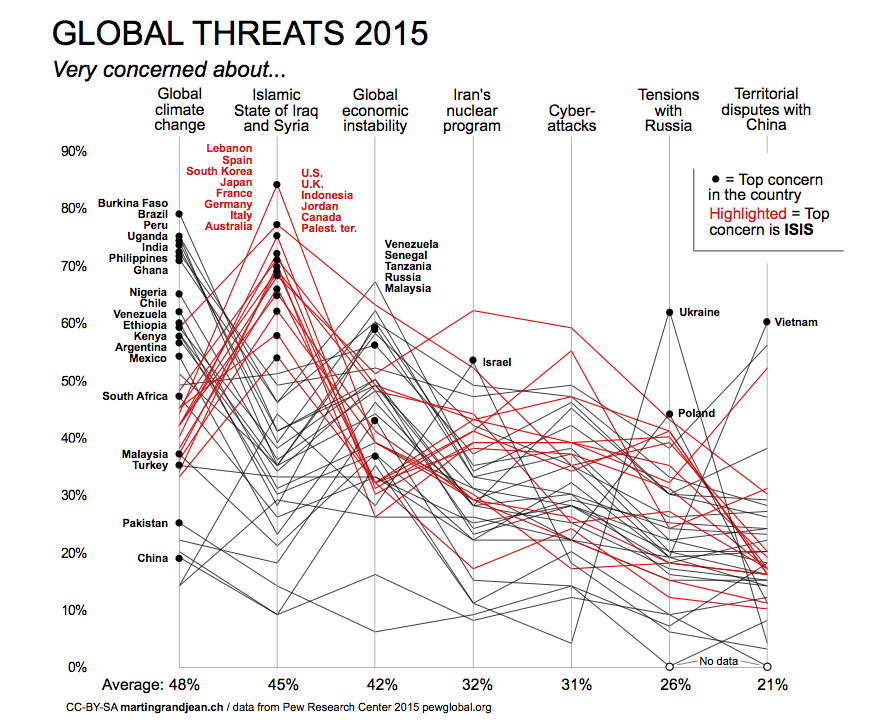
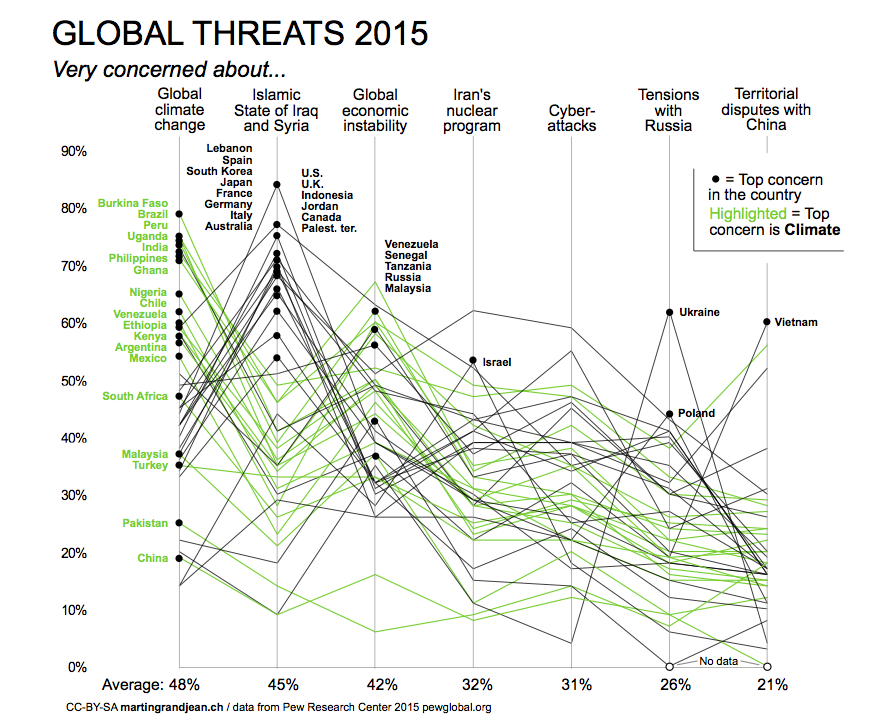
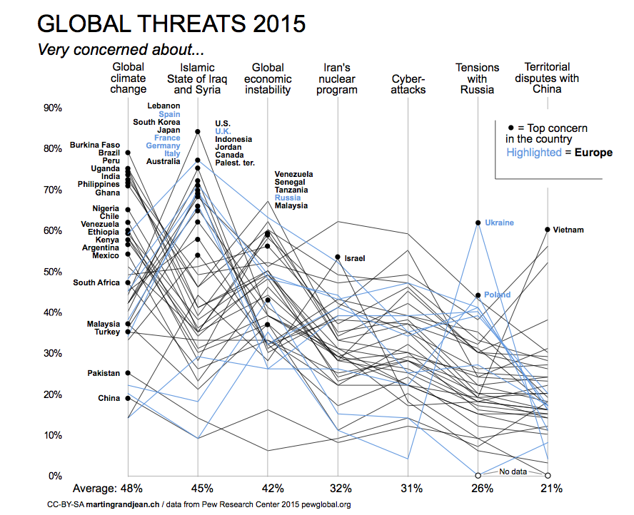
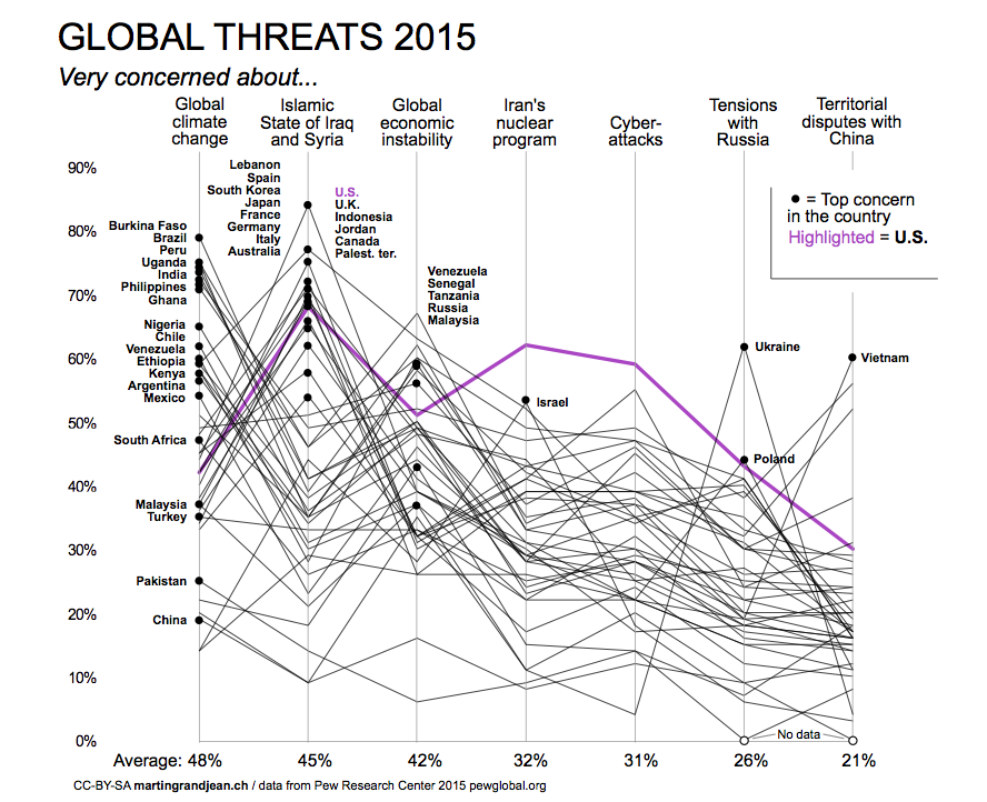
The following charts visualize the results of a survey conducted by the Pew Research Center in Spring 2015 with 45,000 persons from 40 different countries. Each line represents a country and the percentage of people who say they are “very concerned” by one (or more) of the 7 proposed threats. All images are under a CC-BY-SA license and may be freely reused with a link to this post.
Islamic State: a major concern in most Western countries
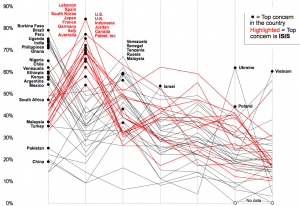
ISIS is the “top concern” in 14 countries, including most of the western countries surveyed and countries more directly concerned (Lebanon, Jordan, Palestinian territories). Yet it appears that this threat is less likely to be mentioned by people who refer to climate change as the top concern.
Climate change: top concern in Africa, South America and Asia
Among the populations of the 40 countries surveyed, global climate change is 19 times the top concern. We observe that this concern is coupled with the fear of economic instability. It mainly affects countries with a modest average purchasing power.
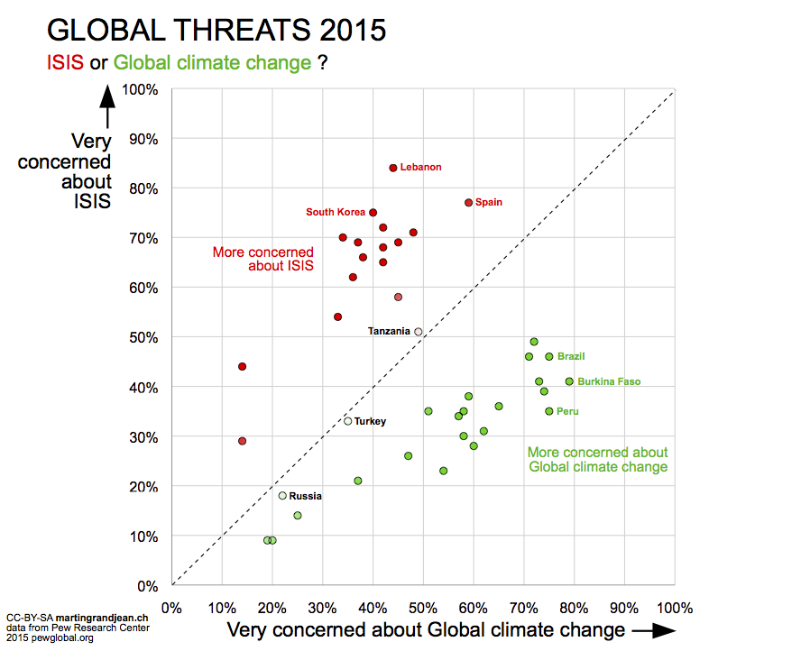
ISIS vs. Global climate change as “top concern”: a clear division
The graph below shows a world clearly divided: on one side the countries where the perceived threat is climate change, and on the other side countries where the Islamic state is considered the main threat. Three countries are positioned between these two poles.
Situation in Europe
According to the results of the surveyed countries, Europe is the scene of a regional threat: the conflict between Russia and Ukraine has the consequence that the Ukrainian population (and their Polish neighbors) is concerned about the tensions with Russia. Russian respondents, on their side, are primarily concerned about economic instability (result of the Ukrainian crisis?). While Western Europe is a pioneer in raising awareness of climate change, this threat seems not to be a major concern.
Situation in the United States
The particularity of the United States is the high level of concern related to the Iranian nuclear program (higher than in Israel), and regarding Cyber-attacks. Relations with China and Russia are also more concerning than in the European countries surveyed.

Interesting topic and dataviz, however I think your visual representation fails at conveying the information with clarity, since it is too crowded and the lines between points have no signification. The comparisons become difficult.
Here is my quick attempt to display the data with a more classic representation, but in my opinion more efficient:
http://postimg.org/image/tz9r28fpv/
Cheers,
Raphaël
Thank you so much for your comment, I’m glad it made you want to try also to play with this data!
You’re completely right about the fact that the “lines between points have no signification”. From my perspective, this is the main concession I made to the great founding principles of data visualization. But this choice also has a very positive visual consequence: being able to see global patterns (“signatures” of the 2 main groups not only based on their response on 1 question but on all of them together).
It also shows that sometimes the “top-threat” in a country is not a concern for many people there (top concern in China is concerning only 19%), that a visualization that highlights results above 50% does not detect.
The main reason for my choice of layout was to avoid having to sort each column separately (in your example, you had to chose where you want the data to be sorted, in columns 1 and 3). Another potential problem with your solution is that in the case where the values are near 50%, the reader may have the visual impression that nothing happens (i.e. Philippines).
Finally, let’s remember that my graph was not intended to be published anywhere. The goal was not to produce a summary of the situation, targeting the greatest clarity (your comment is right, the information is no obvious immediately), but to offer a different perspective on the data.
Thanks for your reply Martin. You’re absolutely right about the fact that my visualization has a tendancy to highlight only majorities (over 50%). Regarding the column sorting, the reason why I sorted on Global warming and ISIS is to clearly convey the main message (top concerns) and reduce cognitivity load for the reader. Here is another version which is less “majority oriented” and also introduces an overall fear level indicator in order not to reduce it to the top threats only:
http://s29.postimg.org/eco24w5bb/global_threats_2.png