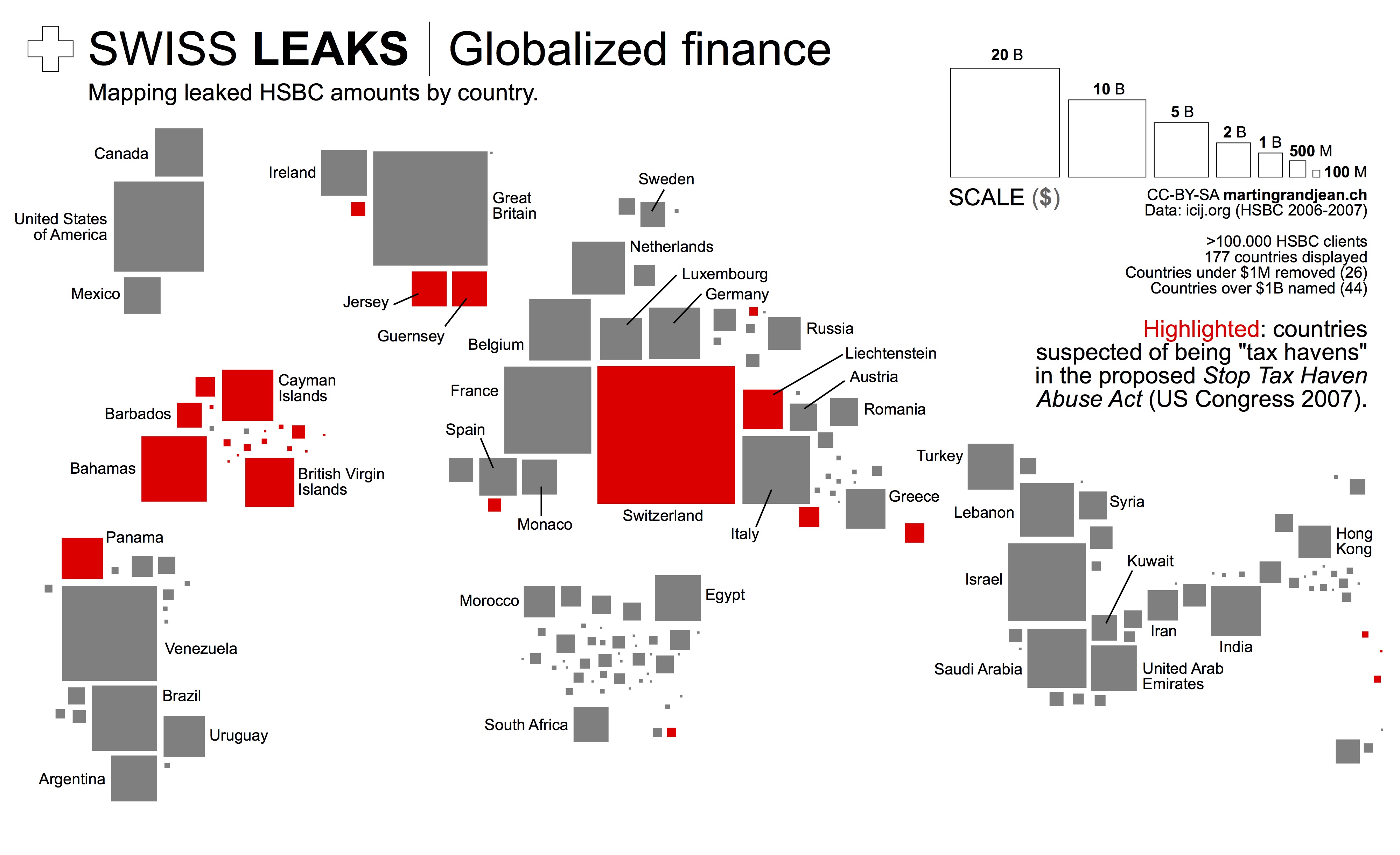
HSBC “Swiss Leaks” data shared by the International Consortium of Investigative Journalists reflect the globalization of tax evasion. While billions of dollars are inconceivable, mapping the origin of bank account holders allows an overview. This map is only a small contribution to the understanding of the Swiss Leaks data:
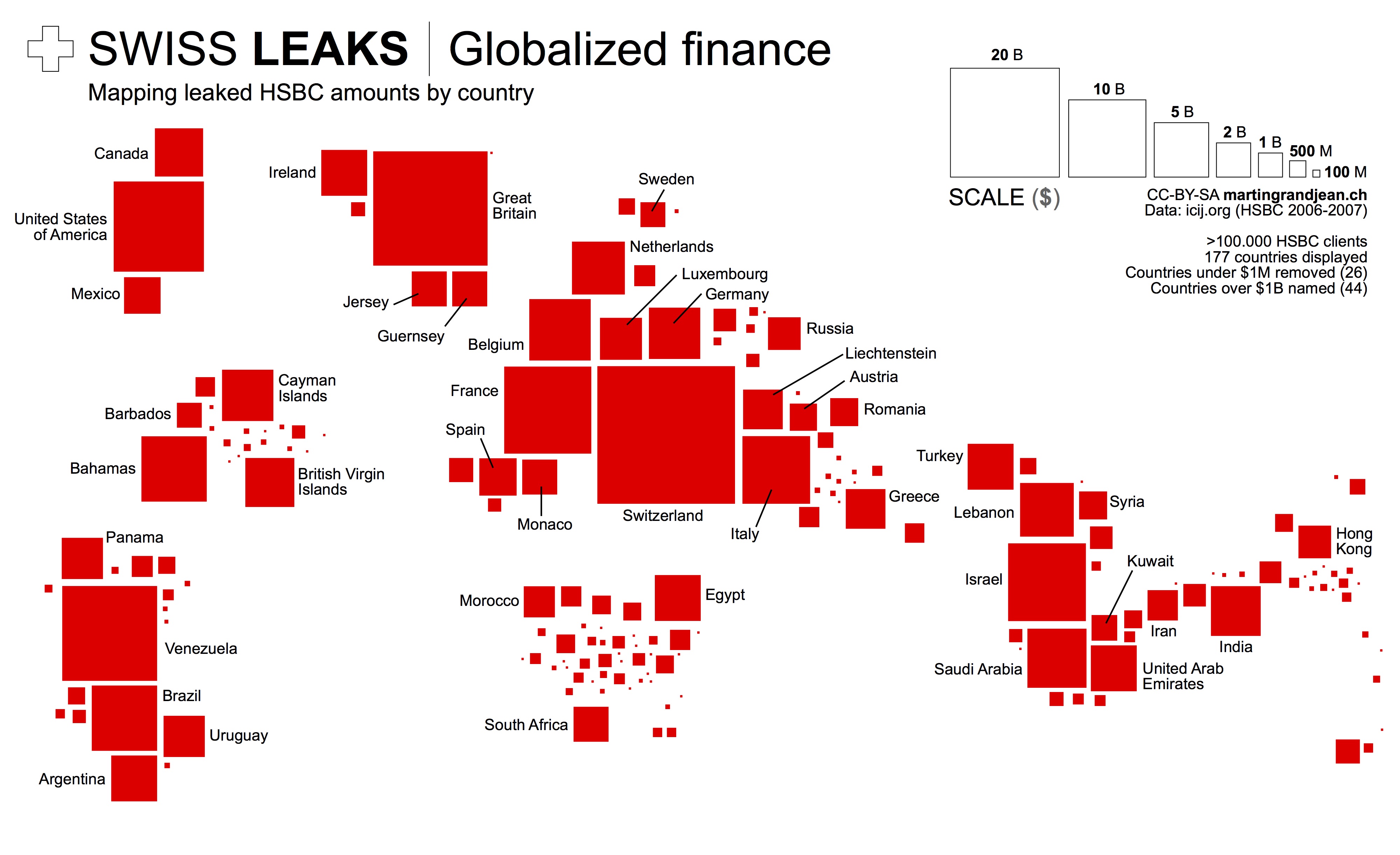
Map of the HSBC accounts amounts per country. Full size here (CC) license – freely reusable with link to this post.
Why this map?
This map does voluntary not strictly stick to the geographical reality. It is a response to too many maps published in the media these days that are made unreadable by regrettable graphic choices: top-ten limited, overlapping points, colored territories (small countries and islands disappear), etc.
What does it show?
The number of affected countries and their diversity is very important. Note the strong presence of the Caribbean. In proportion to their population, South and East Asia are very poorly represented, while the Middle East is over-represented. The strong presence of “tax havens” is explained by the use of intermediates by the holders of bank accounts.

Bonjour,
I find this graphic very enlightening, but it would be enhanced if accompanied (not substituted!) by another showing a proportion with the total economic size of the country, realizing the different importance of similar boxes: let us compare Ireland – Germany, or USA – Venezuela, for instance.
Maybe it is possible to map this additional dimension in the same graphic, e. g. drawing the boxes in lighter or deeper red.
Absolutely correct! This weighted map would probably highlight the “tax havens”. I was thinking about playing with a light/deep scale, but the problem is that this economic data is coming from different sources and its implementation here would give me too much work (it’s just a one shot viz)…
Point of view from YV, tax heavens exists because people in goverments promotes them to hide their own dirty money