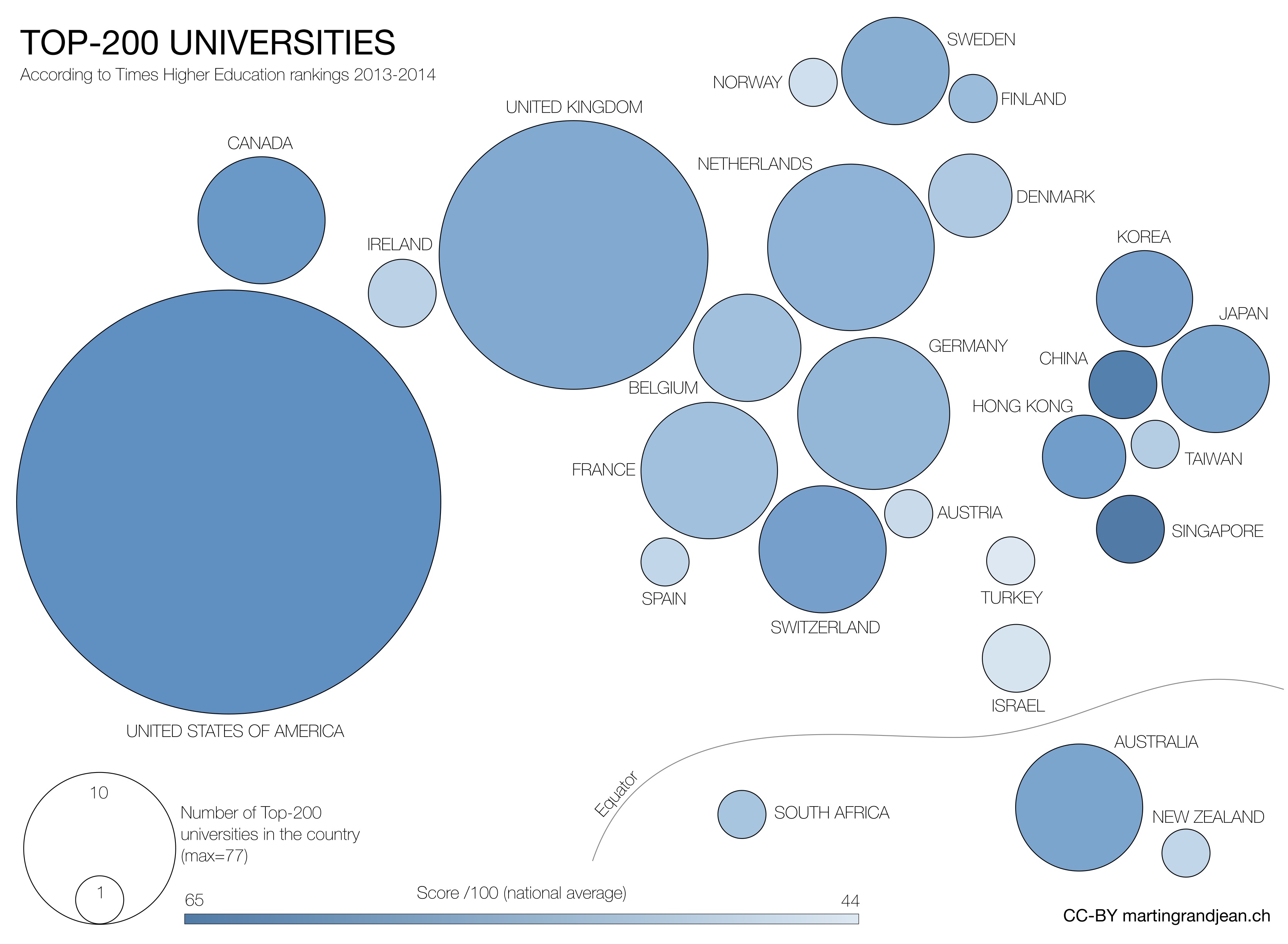
Result of the combination of 13 indicators, the “score” attributed to universities by the Times Higher Education offers a point of comparison between these institutions. Even if this measure is controversial, and despite the fact that local results are subject to wide variations, the average by country is not without interest to draw a global vision of the world’s academic situation.

Full screen here (3300×2400). (CC) license – freely reusable with link to this post.
This small post is just a visualization exercice, as an item to add to the debate on the advantages and disadvantages of this tradition of the “rankings”.
 This map is inspired by the work of researchers from OII (Oxford Internet Institute) – here right – whose visual aspect left me a little puzzled. In order to add to the quantitative parameter a qualitative one, I limited myself to the first 200 universities since the Times Higher Education does not provide the “score” for the following. The Map of OII takes the continent and then the metropolitan area (the “Greater London”, for example) as territorial unit. This is a surprising choice because this unit is sometimes only “intellectual” and does not take into account that universities are sometimes very close to each other, but in different “metropolitan areas”: Switzerland is a very good example of a very small country with a very high proportion of universities in the top-400 (66%). I find however interesting their choice to represent the Equator and to qualify universities according to the country economy classification of the World Bank.
Finally, these analysis and rankings must not makes us forget that they only take into account the tip of the iceberg, and that the economic, social and cultural health of a country is not measured by its number of institutions in the “top-200”. Moreover, are these measures able to provide interesting insights to the universities themselves?
Update: Read also “Unequal Elite: The THE World University Rankings” by Benjamin Hennig

I miss the Russian Universities, those who gave name to new chemical elements…. just a comment.